About the Project
I redesigned the Camelot Insurance website to modernize an outdated platform, improving both its visual identity and user experience. The previous site had an old-fashioned design and lacked essential information, making navigation difficult for users.
My focus was on enhancing usability, ensuring clear and comprehensive content, and creating a seamless experience across all devices.
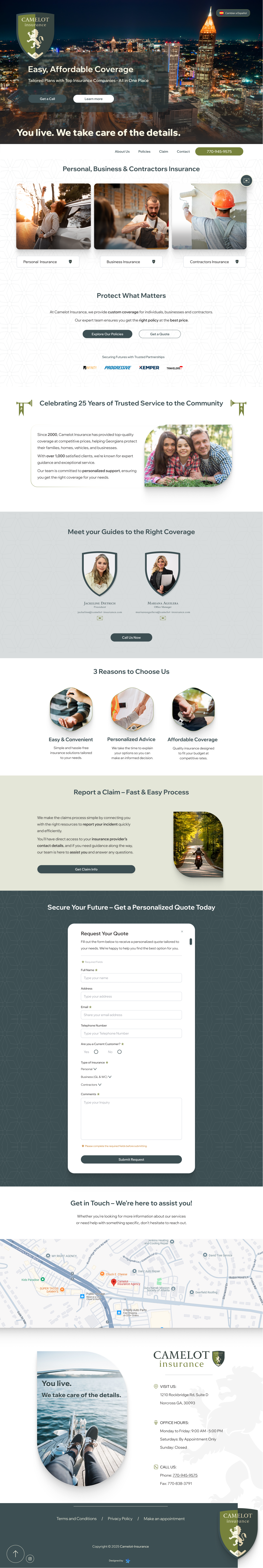
Before

After

Why this version works better
• Simplified & User-Friendly: Concise, scannable and easy to read.
• Clear Call To Actions (CTAs): Encourages action with direct phrases.
• Engaging Tone: More reassuring and customer-focused.
• Contact details are clearly presented, making them easy for users to find while navigating the website.
Programs Used
SEO Improvements
- Keyword Optimization: Includes relevant search terms.
- Engaging Headings: Improves readability and ranking.
- Internal Linking: Enhances navigation and SEO.
- User Interaction: Strong CTAs boost engagement and rankings.
Challenges
One of the main challenges in the design of this website was implementing animations and micro-interactions that enhanced the experience without compromising speed or load times. To achieve this, I chose simple yet impactful animations that encouraged user interaction, sparking curiosity while helping maintain user attention and engagement.
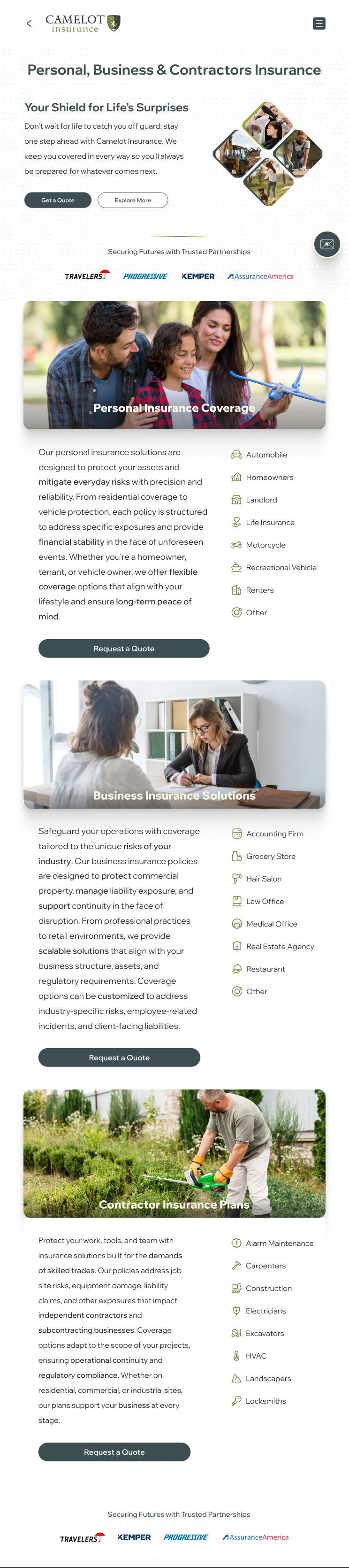
UI Design
The UI design focused on creating a clean, intuitive and visually engaging interface. I replaced the previous brown and black color scheme with a range of greens to evoke a sense of trust, growth and renewal—values that resonate more strongly with today's insurance clients. Consistent use of color, typography, and layout helped strengthen the brand's presence across the site.
 Clear Information HierarchyResponsive DesignIntuitive NavigationInteractive Elements
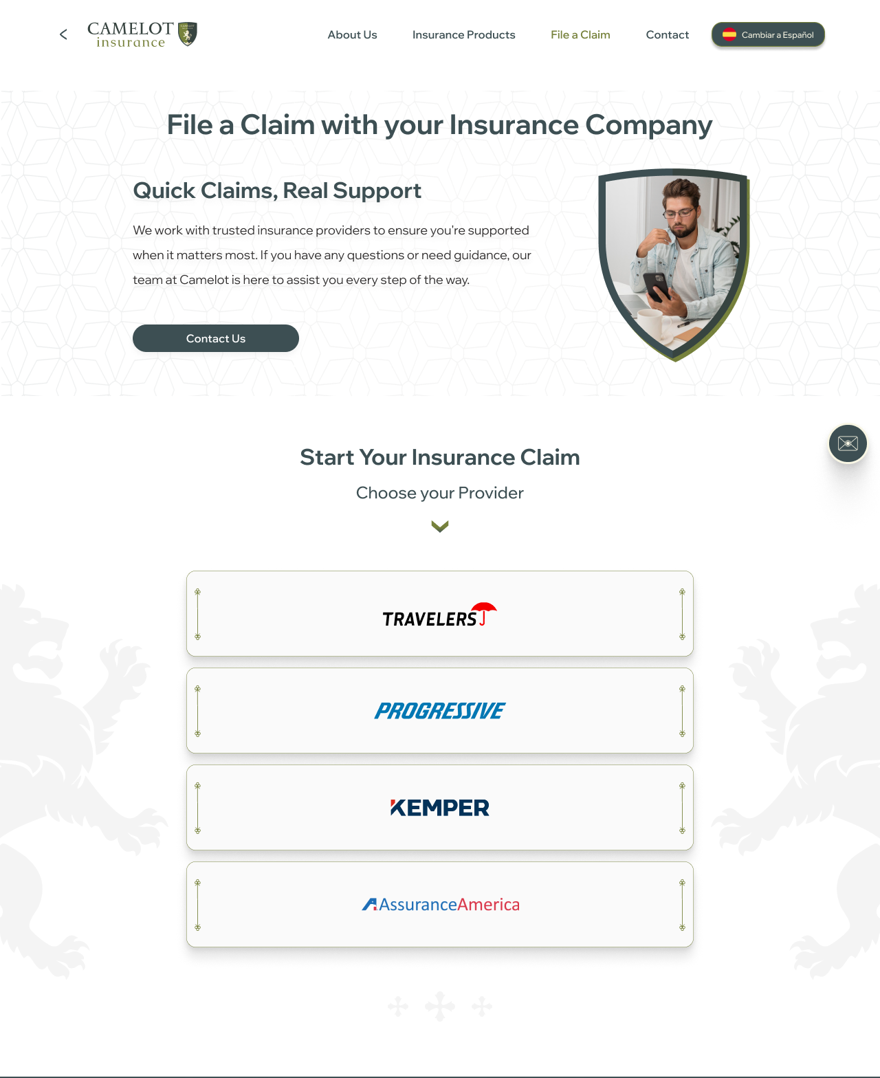
Logo Redesign
As part of this website redesign, I also led the modernization of the brand's visual identity. This involved refining the original logo while preserving its core elements to ensure continuity with the brand's heritage. The updated design brought a more polished and cohesive look, aligning with the website's modern interface and resonating with a more contemporary audience.
Before
After
Visit the website
Feel free to check out camelot-insurance.com. I'm excited to share my work with you!
SEO Improvements
- Quote Requests: Number of insurance quote requests.
- User engagement: Average time spent on site.
- SEO Optimization: Search visibility for key services.