About the Project
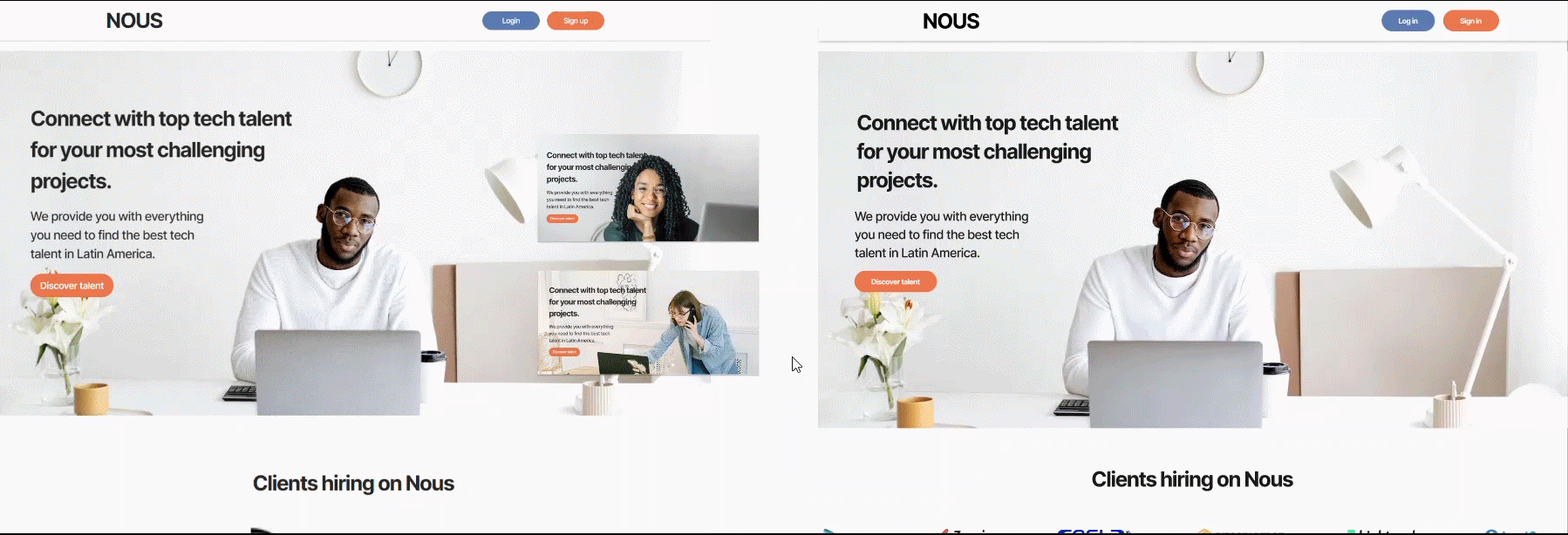
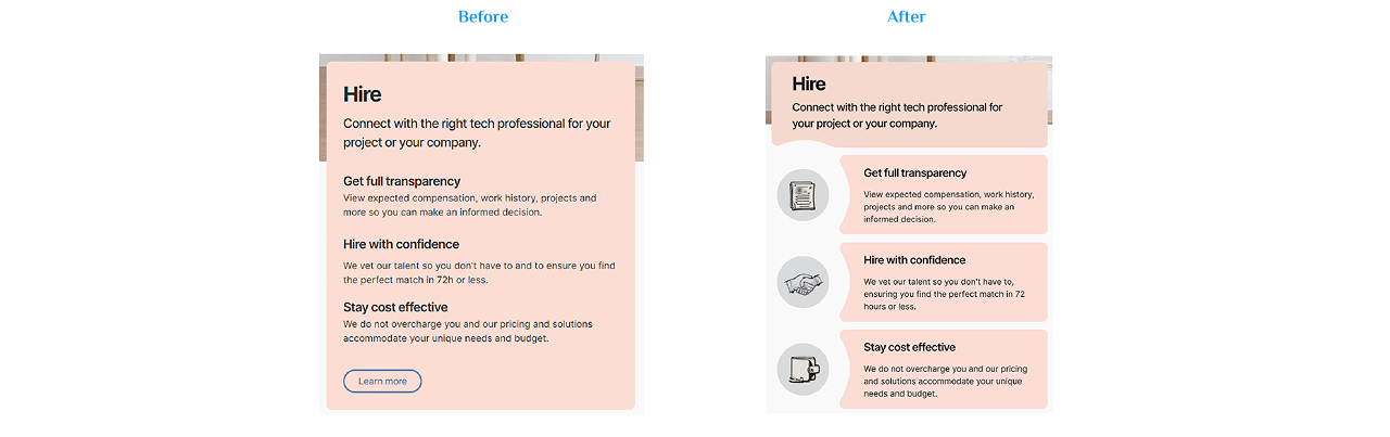
I redesigned the Home page of NOUS Latam to enhance the user experience while preserving its original sections and aesthetics as well as the architecture design. By making a few strategic adjustments, I improved the page's visual appeal and user engagement, effectively supporting its primary goal: connecting companies and professionals in the IT sector.
Before
After
Discover Phase
Through analysis and exploration, I identified that the platform could benefit from:
- Improved user experience through more intuitive information flow and navigation.
- Enhanced presentation of key elements like client logos and cards to encourage engagement.
- A structured approach to content layout, providing clarity and focus.
Programs Used
Goals
- Enhance the visibility and usability of the platform.
- Create a more engaging and user-friendly experience.
- Increase client negotiations and organic growth.
Clients hiring on Nous


Challenges
- Modify the content layout and introduce new features in sections where the reading flow was disrupted.
- Balance the integration of new design elements with the platform's original aesthetic.
- Streamline extensive content for easy consumption while retaining key details.
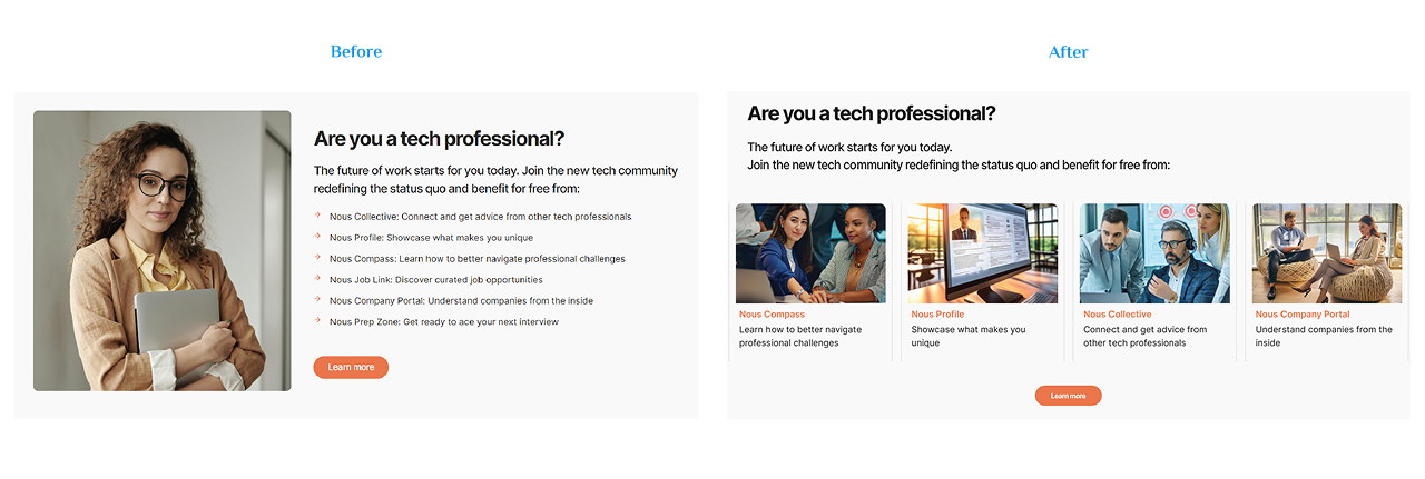
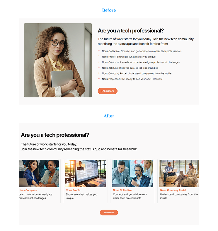
UI Design Changes
- 🆕 A new UI kit was created with components for buttons, icons, and cards to ensure design consistency.
- 🔝 The topbar stays visible as users navigate, helping build a database of professionals and businesses.
- 🌀 Logos now appear in a high-definition, animated carousel for better visibility.
- ✨ Large text blocks are redesigned with icons for easier scanning.
- ❌ "Learn more" buttons were removed as they only prompted logins, not navigation.
- 🎡 New slide and carousel cards boost engagement and curiosity.
- 🔽 The footer is reorganized into four columns with an animated logo for brand awareness.
- 📚 Text and content are structured into cards and columns for improved readability and interaction.
- 🎨 Visual hierarchy and aesthetics were refined to enhance user engagement.

A Fresh Look
After the redesign, the home page became more user-friendly and visually appealing, with a clearer layout and improved content organization. As a result, NOUS is now positioned to stand out in its field, attracting more registrations and views, fostering greater client engagement, and ultimately contributing to the company's overall growth.