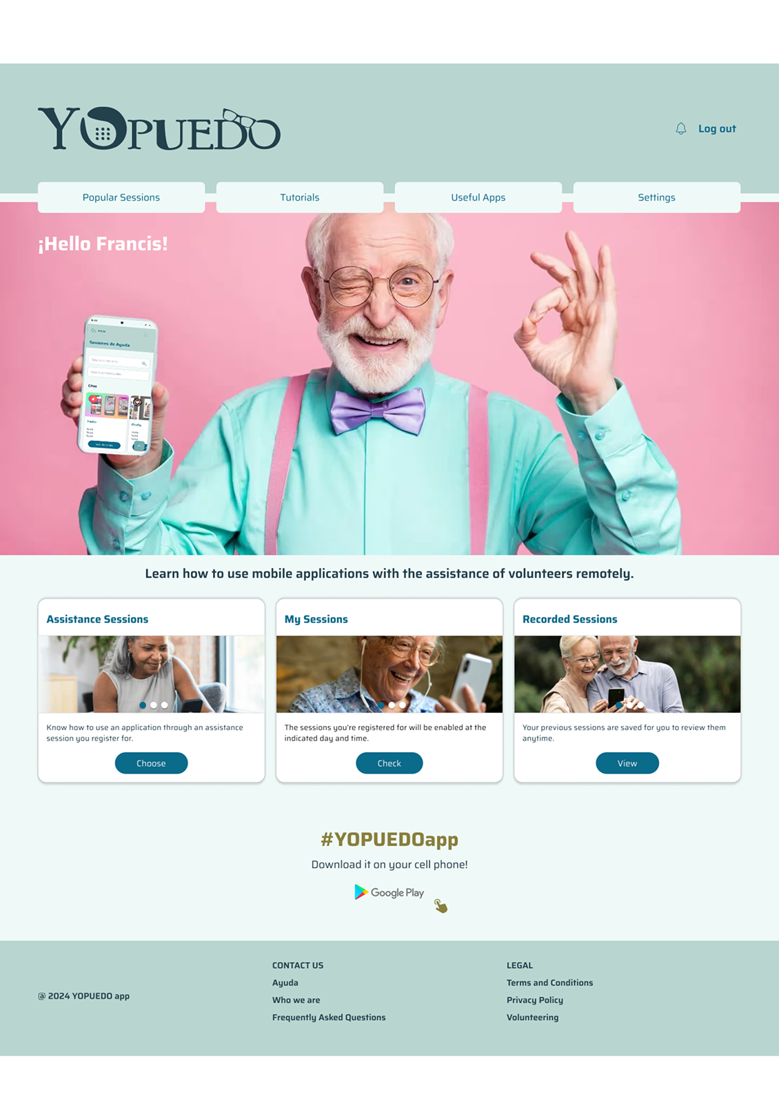
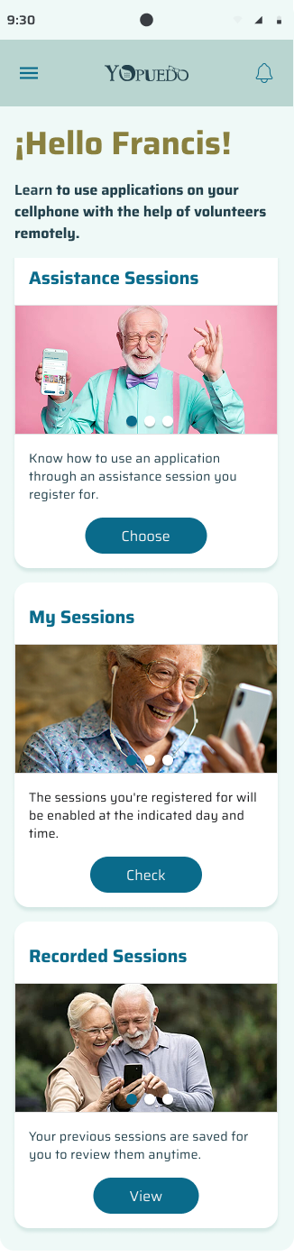
About the Project
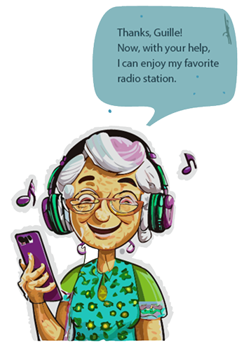
Mobile/web design that enables the elderly to access remote assistance sessions provided by volunteers in a simple way.
Programs Used


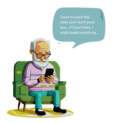
Discover Phase
Going through this stage was a rewarding challenge. I delved into a world that demands a great deal of empathy and understanding. Considering the age and digital literacy level of the target users, it was essential to deeply research their consumption habits, routines, and the barriers or fears older adults face when using mobile devices. This provided incredibly valuable insights for designing an app that is extremely intuitive, easy to use, and meets the users' needs.
Goals
- Empowering Older Adults: An easy-to-use app to build confidence and independence.
- Enhancing User Interaction: Simple design with big buttons and clear instructions.
- Improving Accessibility: Features that meet the needs of older users for greater comfort.
Challenges
Designing an app to connect seniors with volunteer remote assistance brings unique challenges. To make it effective, I focused on keeping it simple and accessible, with intuitive, user-friendly features. That's why I chose large buttons, clear text, and a straightforward layout, which make it easier for elderly users, especially those who may struggle with technology. I also conducted extensive testing with seniors to ensure the app meets their needs and works effectively for them.
UI Design
I choose specific fonts and color styles to enhance readability, establish visual hierarchies, and create an attractive and consistent experience. Additionally, these elements contribute to accessibility and facilitate the communication of states, promoting an emotional connection that leads to greater retention and participation.
A/B Testing
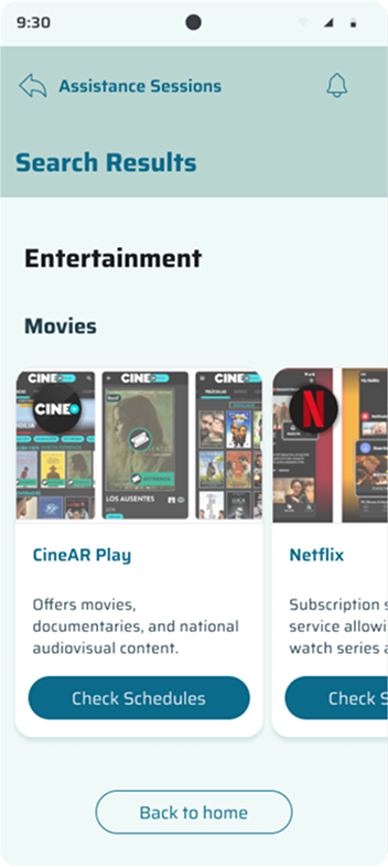
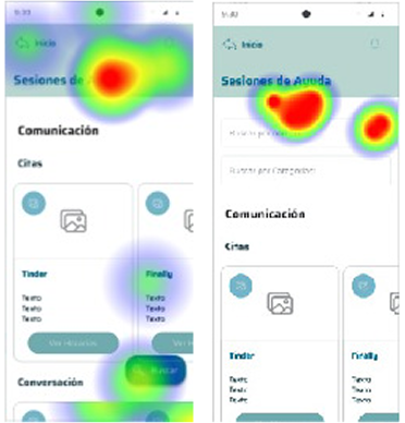
I ran an A/B test in the YOPUEDO app to find the best way to improve the Assistance Sessions section, a key part of the app. I compared keeping the list of cards visible, which works well for older adults who prefer straightforward navigation, with two new options: adding a search bar feature by name and categories for quicker access and introducing a floating button to make things easier.
Testing Results
I added the search bars as tests showed they improve option selection for seniors, making it smoother and more user-friendly.

Search Bars:
By Name
- Improves navigation
- Saves time
- Adapts to context
- Enhances experience
By Categories
- Organizes content
- Filters efficiently
- Reduces clutter
- Supports themes