UX UI Designer: Nathalie D. Rodriguez
Project Manager: Lourdes Romero
Developer: Federica Ulzurrum
Chief Executive Officer: Brian Dordevic
Client: Reputation Arm
About the Project
ReputationArm is an all-in-one reputation management platform for local and multi-location businesses. It helps companies verify and optimize their listings, monitor and respond to reviews across platforms, publish updates to their Google Business Profiles, and generate more reviews through automated campaigns.
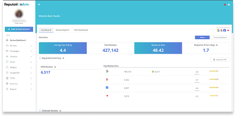
Before
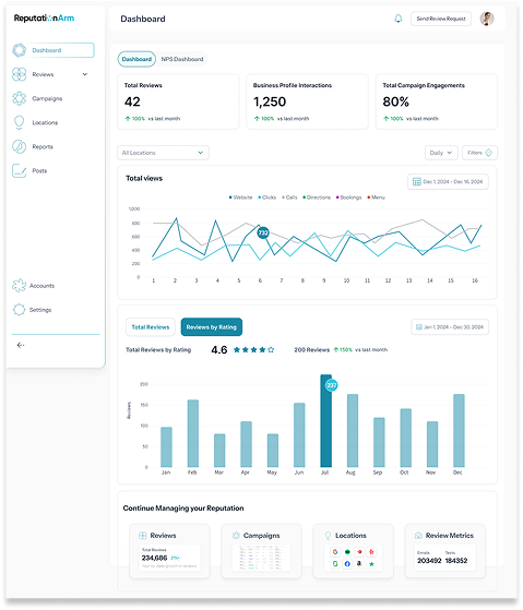
After
Visit the Website
Feel free to check out reputationarm.com.
Programs Used
Step 1: In-Depth Exploration of the Existing Product
I spent time thoroughly analyzing the current platform. This included:
- UI Audit: I reviewed all existing screens and the current information architecture to understand how content was organized.
- Mapping current user flows: I tracked the steps users had to take to complete key tasks, such as checking a location’s performance or launching a campaign.
- Identifying friction points: I uncovered redundant steps, duplicated information, and navigation issues — many of which stemmed from the disjointed location-related content.
This analysis was crucial to fully understand how the tool worked and identify which features needed to be improved or restructured.
Step 2: Understanding the Client’s Core Need
The client's most important request was to centralize all location-related information in one single section.
Previously, users had to navigate multiple sections to view or act on data related to a specific location. This created confusion, wasted time, and increased the chance of errors.
The new solution needed to simplify this process without removing essential features.
Step 3: The Solutions
The redesign was driven by three major improvements that transformed the user experience:
1. Reorganized and Simplified Navigation:
I restructured the main navigation to make it more intuitive and task-oriented. Instead of having overlapping or unclear access points, the primary services were clearly defined: Reviews, Campaigns, Locations, Reports, Posts, Accounts, and Settings — each with their own submenus containing all relevant features and data. This change significantly reduced cognitive load and improved task efficiency.
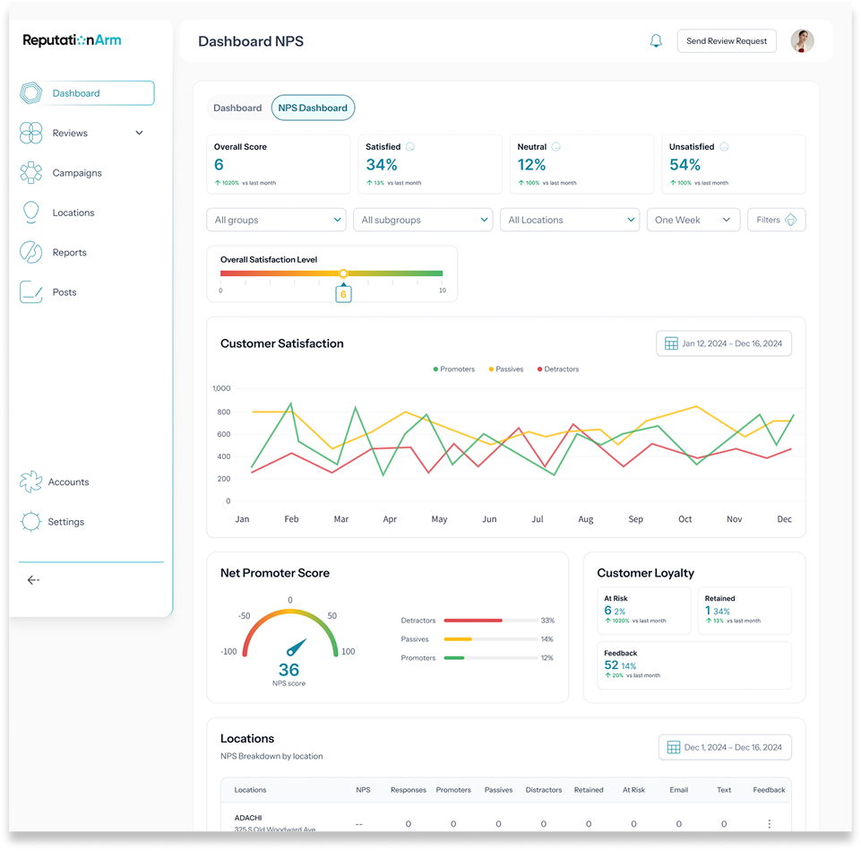
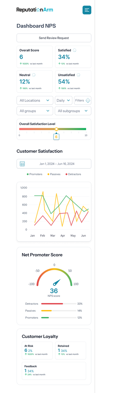
2. Dashboard Redesign:
The dashboard previously displayed partial, disconnected information. I redesigned it entirely to provide a clearer, more actionable overview. It now shows:
- Key statistics and performance metrics of active accounts
- Graphs and summaries that give users an at-a-glance understanding of what needs attention
- Clear visual prioritization to help users quickly move to high-impact tasks, such as responding to customer reviews or launching new campaigns
The result is a clean, structured, and insightful entry point that aligns with users’ real needs.
3. Section-Based “Hubs” for Focused Management:
To make the platform easier to navigate and understand, I introduced a Hub system. Each key section now has its own dedicated space — a dashboard-like hub that centralizes everything related to that topic:
- Reviews Hub
- Campaign Log
- Locations Hub
- Accounts Hub
This approach allows users to find everything they need in one place, without jumping across multiple modules or repeating tasks.
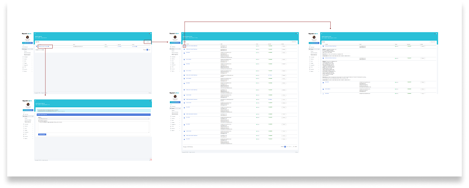
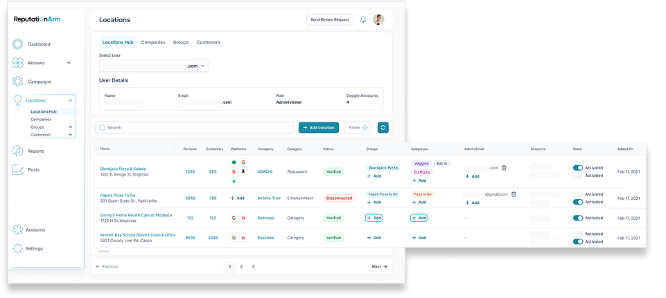
The “Locations Hub”:
The most important change addressed the specific pain point raised by the client: locations and citations were scattered across the platform, with multiple access points and inconsistent organization.
The solution was the creation of the Locations Hub, a dedicated space where users can:
- View detailed information for each location
- See all reviews grouped by location
- Access performance metrics and insights
- Manage campaigns and accounts related to a specific location
This centralization transformed a fragmented experience into a coherent, efficient and intuitive one, giving users a powerful command center for one of the platform’s most critical features.
Why this version works better
- Simplified & User-Friendly: Concise, scannable and easy to read.
- Clear Call To Actions (CTAs): Encourages action with direct phrases.
- Engaging Tone: More reassuring and customer-focused.
- Contact details are clearly presented, making them easy for users to find while navigating the website.
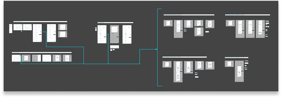
Step 4: Designing New User Flows
Based on earlier findings, I designed new optimized flows that provided a more logical and simplified experience. Key improvements included:
From the Dashboard to Locations Hub: A direct access point for users to quickly identify which locations need attention.
Centralized review management by location: Users can respond to, tag and analyze reviews from a single place.
Campaign integration: Quick access to current or past campaigns related to each location.
I developed these flows always prioritizing visual hierarchy, accessibility, and consistent component use.
Step 5: Testing with Users
Once the changes were implemented, we tested the redesigned experience with 6 current customers already using the platform. This phase allowed us to:
- Detect final tweaks before full rollout
- Collect direct feedback on the new flows and the Locations Hub
- Measure improvements in clarity, navigation, and task completion
The results were very positive: users quickly understood the new structure, completed key tasks with fewer steps, and highlighted the clarity and usefulness of the new module.
This confirmed that the redesign was both functional and effective.
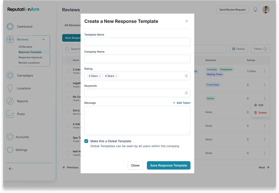
Step 6: UI Redesign
Once the flows were defined, I moved on to redesigning the platform’s visual interface.
UI decisions were based on:
- Visual simplicity with a focus on usability.
- Consistent use of colors and typography for improved readability
- Reusable components to support future product growth
- Refined tables, cards and filters to handle large volumes of data while maintaining clarity
- Designed a custom set of 50 icons to enhance navigation and reinforce the platform’s visual identity
I also ensured the new design was responsive and scalable.
Icons
Responsive Dashboard View
Final Results
A Clearer, More Streamlined, User-Centered Experience.
- With the new Locations Hub, users now have a centralized, intuitive view of all their locations.
- Key actions are easier to perform, and platform navigation is far more fluid and efficient.
- Testing with real users validated the improvements and confirmed that the redesign delivered real value
Visit the Website
Feel free to check out reputationarm.com.